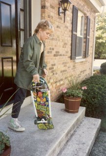
 Not just a mullet, folks.
A rattail.
He's got the colored Chuck's, he's got the board and you know he's got the attitude.
In the now version, he is the hyperthinking, hyperkinetic Blue Balls* drinking publisher that just happened to put out CrimeSpree's book of the year.
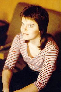
If you'll remember, your humble poster has also sported a full on 80's mullet. Ben is, of course, waaaaaaaayyyyy cooler than Jen Jett.
*Red Bull and Blue Gator Aide

3 comments:
Yea, but Jen's cuter.
Okay, not entirely sure as I've just had a very very quick peek at your source, but, in your template you have
.title {
font-size: 30px;
font-weight: bold;
font-family: arial, sans-serif;
text-align: center;
letter-spacing: 10px;
color: #666699;
position: absolute;
padding: 0px;
height: 50px;
left: 10px;
right: 10px;
top: 0px; - this is the bit I would change. Set it to 10, maybe 20 px and see how things look.
Also, do remember to back up your template in case this is totally incorrect :)
You may also want to change the same part of your .quip to make it appear under your title? If, of course that is where you want it
Post a Comment